A landing page contact form is one of the most important items used to convert leads, and yet so many marketers fail at designing them correctly. Forms are often subject to the “Goldlilocks syndrome:” too long and you can intimidate prospects from filling it out, too short and you may end up with a bunch of marketing qualified leads (instead of sales qualified leads).
Landing page contact forms should be optimized for your visitors based on the marketing funnel stage of your offer. The further down the funnel your prospect is, the more information you can request of visitors and generally see better results.
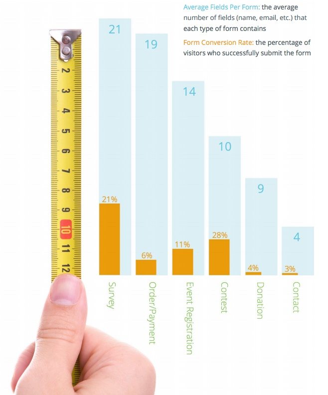
There are countless articles available online that state fewer form fields will produce a higher conversion rate, which may be true to an extent. But as the chart below demonstrates, the type (and length) of form makes a huge difference.
Formstack’s 2014 Form Conversion Report showed that only 6% of users would fill in roughly 19 form fields of an order page, 28% of people entering a contest will tolerate 10 form fields, but only 3% of users will fill out 4 fields on a contact form. The contact form has the lowest average number of fields, and the lowest average number of entries:
So, how do you design a contact form where you’re achieving your goals, but not making your potential customers feel interrogated? First, you need to understand the sales funnel to develop your landing page form strategy.
To determine how many form fields you should include, confirm where in the marketing funnel your offer is placed:
- Top of the funnel: For this stage, the objective here is to generate as many leads as possible, so not many fields are needed. You can nurture them to a sale through email later.
- Middle of the funnel: Middle of the funnel offers explain why your product or service is the best option to solve the visitor’s problem. Typical content at this stage includes but is not limited to, webinars, case studies, free samples, etc.
- Bottom of the funnel: Bottom of the funnel leads are in the market to buy now, and are just deciding on who to purchase from. Brands can get away with longer forms at this stage because prospects that see these offers (ex: product demos, free consultations) are in the decision-making stage.
With the funnel stages addressed, let’s see how to design landing page contact forms in each stage.
Top of the funnel landing page forms
Top of the funnel leads are window shoppers. They have a problem or need, and they are looking for the solution to meet their need.
Short forms typically result in more leads because prospects don’t have to divulge as much personal information about themselves. If you’re not consistently generating leads, it could be an indication that you have landing page friction and your form needs to be adjusted. Ask for enough information (e.g. name and email) that allows you to contact your lead and nurture them further down the funnel. This allows you to limit unnecessary fields (job title, income, budget, etc.) that you can ask for later and help with qualifying leads.
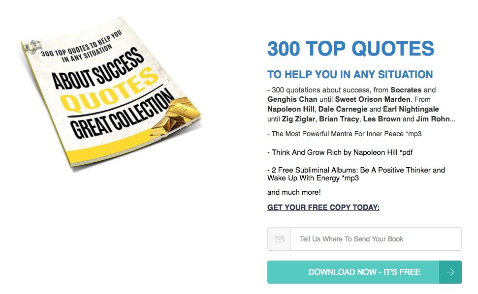
Common top of the funnel offers include blog subscriptions, ebooks, or tip sheet downloads because many times only a visitor’s name and/or email address are requested.
Live Today with Passion offers a free quote book download to anyone who provides their email address through this landing page:
Middle of the funnel landing page forms
Middle of the funnel leads are those who are in the consideration and validation stage of the buying process. In this stage, prospective buyers need more information, so they seek out case studies, product brochures, join webinars, etc. to make an informed buying decision. Any content you can provide that demonstrates how your product or service provides the solution to their needs is beneficial here.
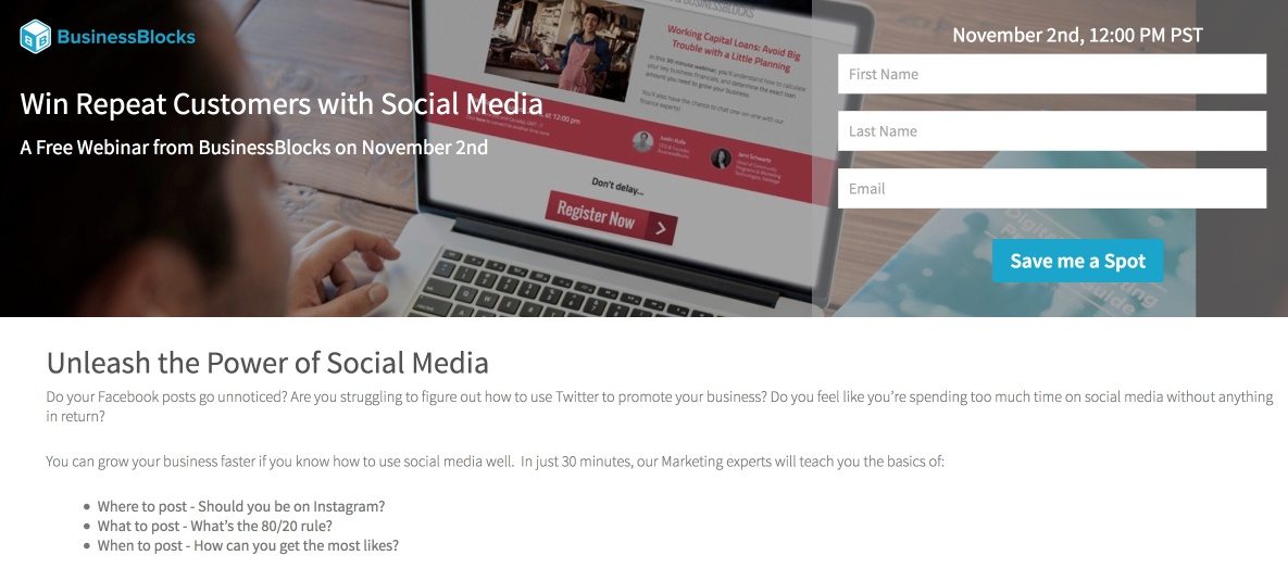
For example, searching “small business social media” BusinessBlocks uses Google Ads to send prospects to the webinar landing page below. On the page, they pose a few potential users’ problems:
- Do your Facebook posts go unnoticed?
- Are you struggling to figure out how to use Twitter for business?
- Spending too much time on social media with no ROI?
Then, they promise the audience how to fix these problems by joining their webinar:
Bottom of the funnel landing page forms
Bottom of the funnel leads are those prospects who are in the purchasing stage. They know what they want, have evaluated all options, and are ready to buy. The question is, from you or your competitor?
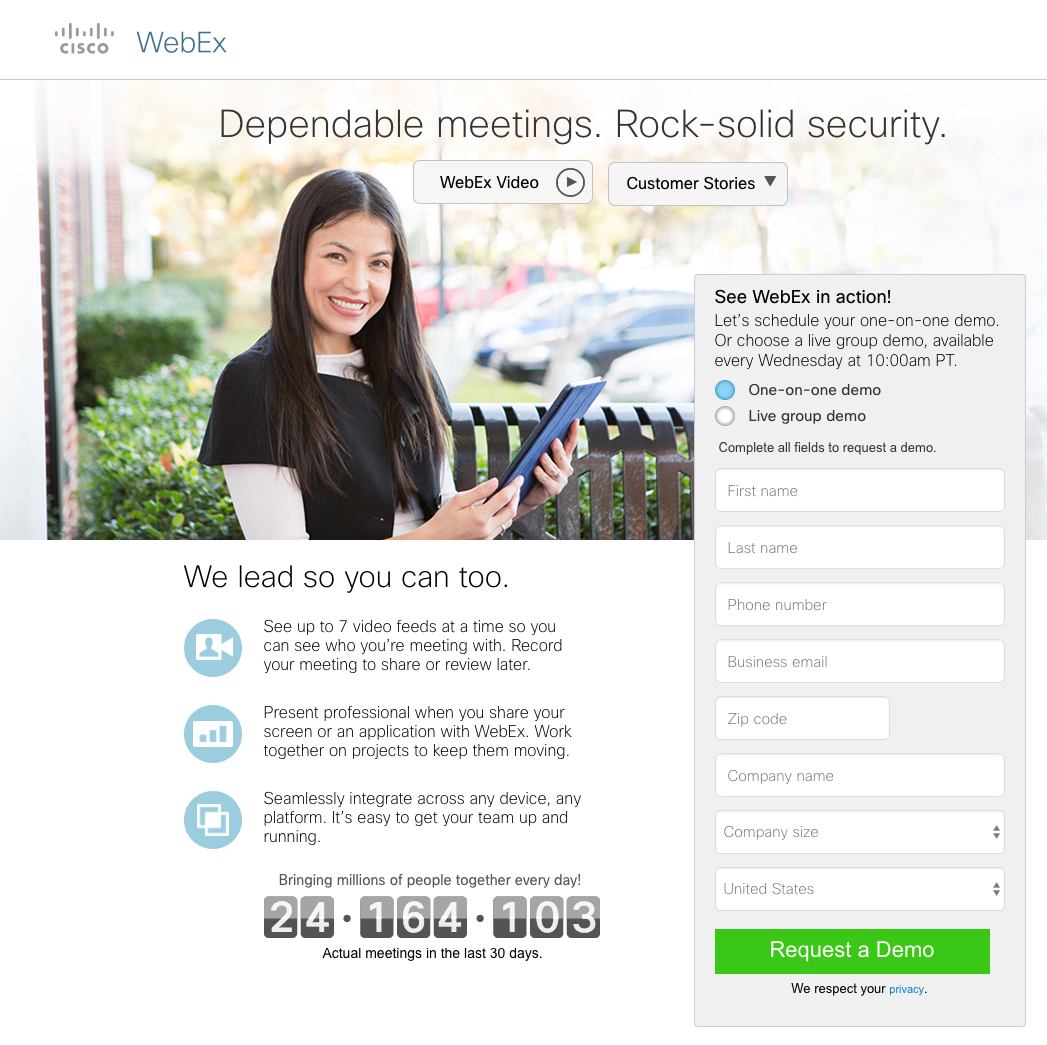
These contact forms are longer because businesses want as much qualifying information as possible. For example, WebEx’s demo landing page requires information such as a business email, to confirm that the prospect works for a legitimate business in need of a video conferencing solution and the number of employees. These details help qualify leads and make following up them easier to close the sale:
Once you have developed your strategy, who you’re targeting, and where the offer is in the buying process, you need to decide what fields you want to make required and which information is optional.
Required form fields
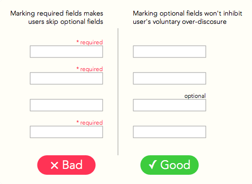
Making all of the form information “required” will likely deter some of your prospects. By using optional fields, you give your prospect the ability to pick and choose what information they are comfortable sharing with you. It makes them feel like they are in control.
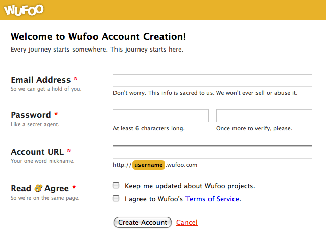
One way to do this is to label your optional fields, not the required fields. For example, all of the red asterisks in this Wufoo form represent required information:
Rather than marking all of the required fields, mark the optional ones accordingly, like this:
Mona Elesseily, VP of Online Marketing Strategy at Page Zero Media, prefers to use a five-field form; three required fields and two optional fields:
- Name – required
- Email – required
- Phone – required
- City – optional
- State – optional
But that depends on what your landing page is offering. If you’re offering a social media trends ebook, would city and state be necessary (even if they’re optional)? If you’re providing top of the funnel content like a free Google Ads best practices tip list, do you really need your prospect’s phone number? What if you’re offering bottom of the funnel content like a free consultation where the prospect is in purchase mode. At that point, you’d likely want more than just five fields to learn more about the visitor and their business. Information such as number of employees, advertising budget, what their biggest pain point is, etc.
The point is this: There is no perfect formula for the number of form fields or how many fields should be required and optional.
As with anything else on your landing page, it’s always good to A/B test different form layouts. For example, will a 6-field form with minimal required information convert at a higher rate than, say, a short form with 3 required fields? You won’t know until your visitors tell you.
Two-step opt-in forms
Two-step opt-in forms are forms broken down into two phases:
- Information phase
- Commitment phase
During the information phase, prospects are in pre-button-click phase — gathering information — and learning about your offer. Your hero shot, copy, testimonials, trust badges, etc. will ultimately make them decide whether or not they will click your CTA button and continue to the commitment phase (post-button-click phase).
Two-step forms help qualify the prospect because they must click the CTA button first, then when the pop-up appears, they have to follow through there as well. Using this type of form also helps simplify your landing pages and reduce clutter. This is because often it’s just a button; if there was a form, the page could potentially look busier.
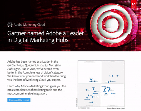
Take this landing page from Adobe, for example. It uses a two-step opt-in because once a visitor clicks the “Download the report” CTA, the form pops up:
Multi-step forms
Multi-step forms are often used in the signup process for a service. Landing page contact forms that are set up in a multi-step format have some indicator (dots, “step 1 of X,” etc.) to let the visitor know what stage they’re in and how many stages are left before the process is complete.
What makes multi-step forms great is that brands can get away with requesting a lot of personal information from prospects by breaking up the form into smaller sections.
The University of Phoenix uses a multi-step form to get all of their prospective students’ information:

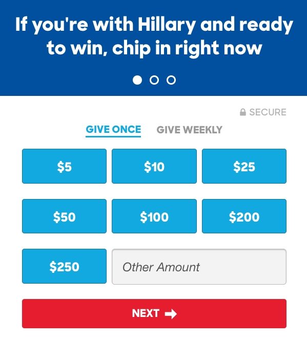
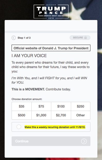
Even both Presidential candidates use multi-step forms. Clinton uses three dots whereas Trump uses “step” on their respective donation pages to learn how much money the person would like to donate. Once that dollar amount is selected, the following steps collect the supporters’ personal information:
Encourage your visitors to take the final step and complete the form by including a call-to-action directly above the form. Notice the headlines from all of the examples above:
- Learn more
- Hillary’s ready to win — chip in if you’re ready too.
- This is a MOVEMENT. Contribute today.
Click-through pages
All standalone, dedicated pages require a post-click landing page contact form of some sort (because that’s how you get a lead/conversion). But, one page type that doesn’t (initially) is a click-through post-click landing page. In fact, it’s one of the most effective and simplest types of landing pages:
The entire purpose of click-through landing pages are to get your visitors to “warm up” to your product by quickly informing them about your offer while getting them to “click-through” to your product or service via your CTA button.
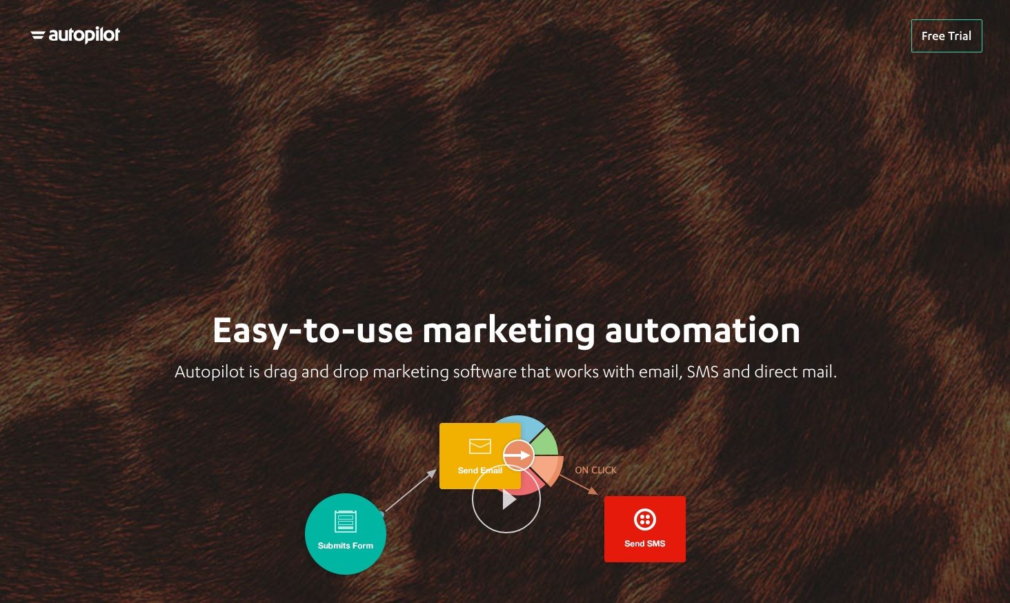
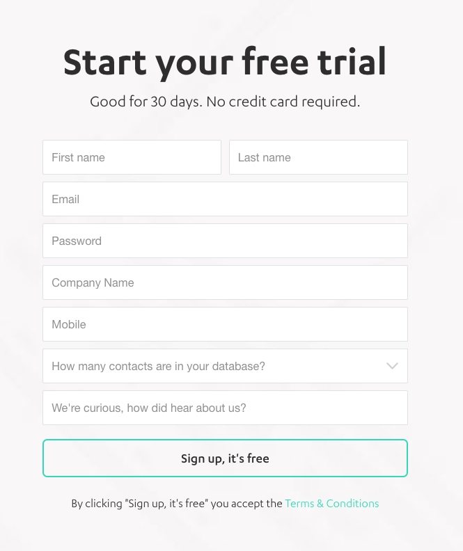
To demonstrate, Autopilot’s landing page “Free Trial” CTA button clicks-through to their sign up page:
What about the fold?
Form placement also plays a role in conversions. Although the “fold” used to be a thing to keep in mind, everybody scrolls now, so longer pages are more common. Cramming every element above the fold should no longer be your focus. Studies show the majority of web users scroll on a given page and many begin scrolling on before the page has even finished loading.
According to Amy Schade of the Nielsen Norman Group:
The fold still exists and still applies… But more than a measurement, the fold is a concept… Users do scroll, but only if what’s above the fold is promising enough…anything that’s hidden and that the user must uncover will only be seen if the user deems it worth the hassle.
So, does the fold matter?
Yes, but you need to get visitors to want to scroll with your above the fold content. That’s where your headline, image or gif, and copy play a big role in keeping your visitor engaged and on the page.
How do you design your landing page forms?
There is a science to designing landing page forms because many variables need to be considered. What stage of the funnel is my offer? How much should I request of my visitors and which fields are required? Is a two-step opt-in or multi-step appropriate?
Don’t worry about finding the “perfect” form because it doesn’t exist. You can, however, optimize yours by A/B testing different types to see which one generates the most conversions. To start; design your professional landing page, A/B test it, and enjoy two-step opt-in and multi-step form functionality with Instapage. Sign up for an Instapage 14-day free trial today.

Try the world's most advanced landing page platform with a risk-free trial.
